Design in Figma
Figma is a free web-based digital design and prototyping application that UI and UX designer use to create websites, apps, or user interface components. There is a web version and a desktop verstion.
Design Tips
Layout grids
- Desktop: standard grid size is 12 columns and gutter size is 20px.
- Mobile: standard grid size is 4 columns, side margins is 16px, and gutter size is 16px.
- Tablet: standard grid size is 8 columns and gutter size is 24px.
Mobile font size 16px is a good place to start when choosing font size for mobile, it is good for paragraphs, labels, menus and lists. Secondary text should be about 2 sizes smaller than your paragaph text. Examples:
- ISO's default font size is 17px and secondary font size is 15px.
- Google's default font size is 16px and secondary font size is 14px.
Hierarchy Designers use hierarchy to show the importance of each page/screen’s contents by using different size for texts and colors.
Figma Tutorial
Prototyping
Enter Prototype mode, drag connections from an element's Node to to another frame
Scrolling
Overlays
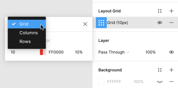
Layout Grid
Designers would use Grid to keep the elements aligned and ordered, and the page design clean and neat.
Components
Components help designers implement consistent designs.